Built the brand
Positioning, logo, palette, type and the rules that keep every piece consistent.
Branding, Packaging & Web Design · CBD & wellness
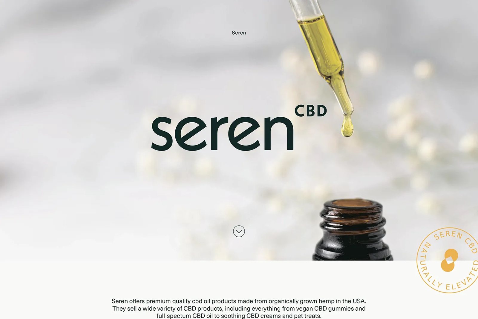
Seren is a premium CBD brand committed to offering high-quality, natural products designed to promote wellness and relaxation. To stand out in the growing CBD market, Seren needed a strong brand identity and packaging that reflected its values of quality, purity, and calm.
 2023
Overview
Seren is a premium CBD brand committed to offering high-quality, natural products designed to promote wellness and relaxation. The brand aims to provide consumers with a trusted, effective solution for stress relief, pain management, and overall well-being. To stand out in the growing CBD market, Seren needed a strong brand identity and packaging that reflected its values of quality, purity, and calm.
Seren faced the challenge of differentiating itself in a crowded CBD market where many brands offered similar products with little distinction. The lack of a unique brand identity and cohesive packaging made it difficult for Seren to attract and retain customers. The existing branding failed to communicate the brand’s commitment to quality and wellness, leaving an opportunity for improvement in both visual appeal and customer connection.
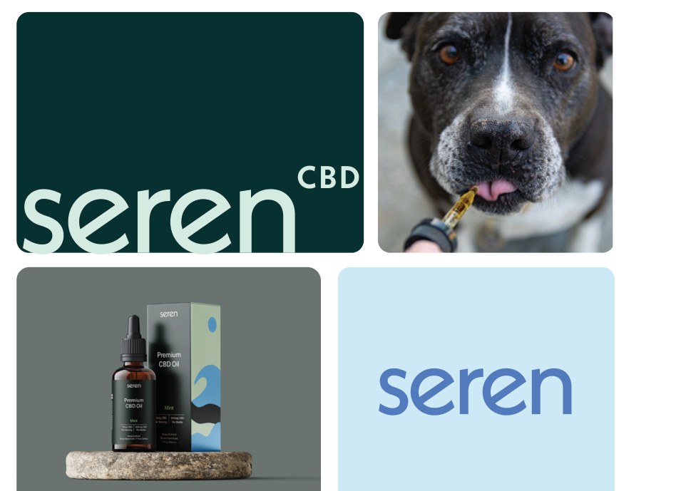
Defining Seren
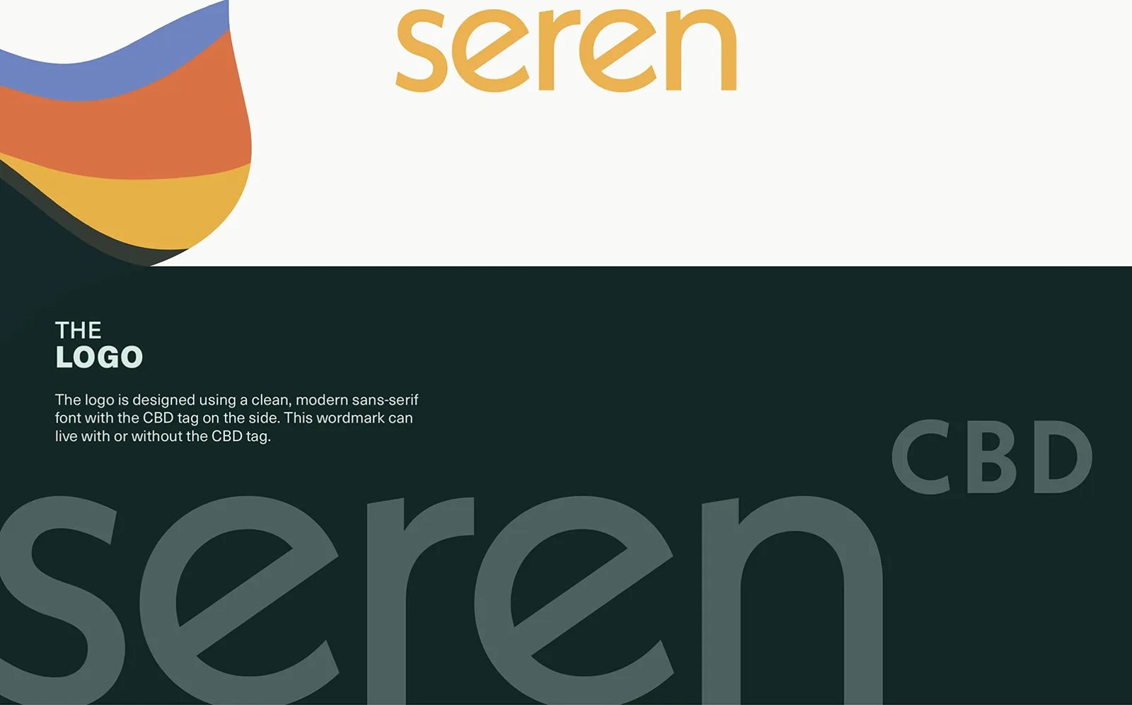
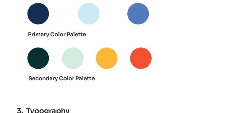
The brand identity for Seren was designed to capture the essence of natural wellness, calm, and premium quality. Key components of the brand identity include:
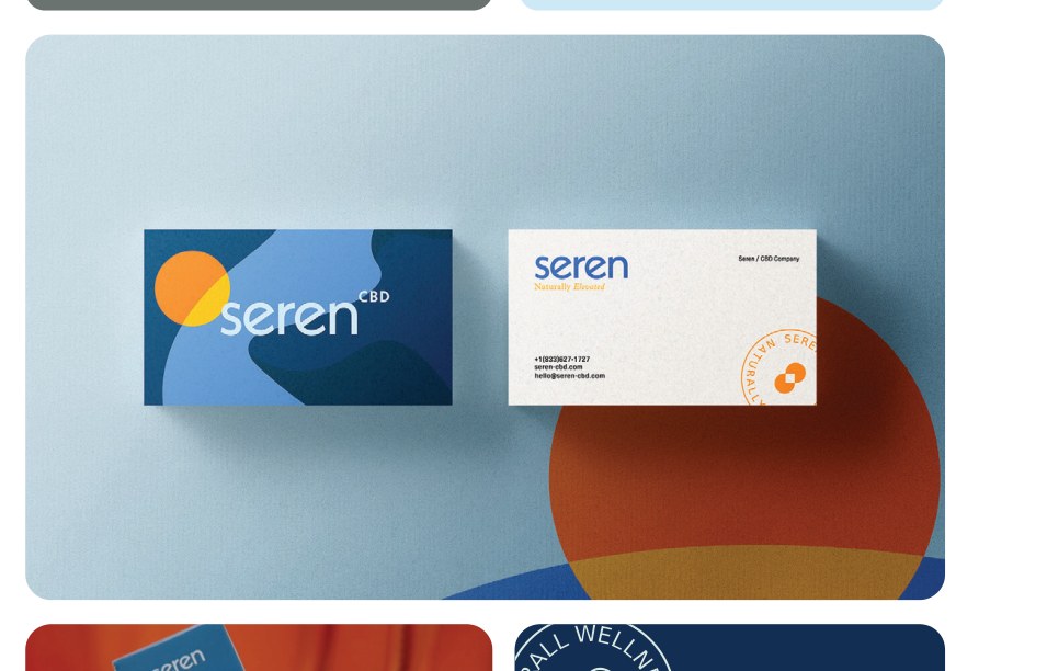
Packaging design
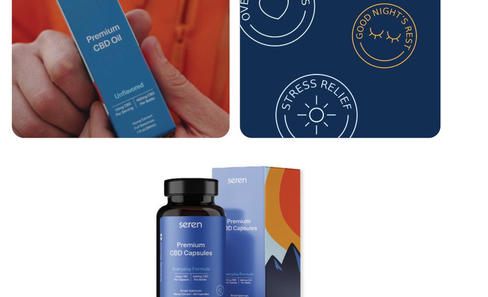
The packaging was designed with simplicity and elegance in mind, aligning with the brand’s focus on wellness and quality. We ensured the packaging complemented the new color palette and logo, making it stand out on shelves while conveying trust and purity.
The updated packaging reflects Seren’s commitment to offering a premium CBD experience, creating an attractive and memorable product lineup.
The Design

What we did
Positioning, logo, palette, type and the rules that keep every piece consistent.
Labels and boxes that carry the identity onto the shelf.
Wireframes, design, copy placement, build and launch on a fast WordPress foundation.
Post templates, a content plan and the campaigns that go with it.
Explore