- Positioning
- The place you occupy in a customer’s mind relative to the alternatives: who you are for, what you do and why you rather than them. Written as one statement.
- Brand identity
- The visual and verbal system that expresses the positioning: logo, colour, typography, imagery, voice and tone.
- Logo, wordmark, icon
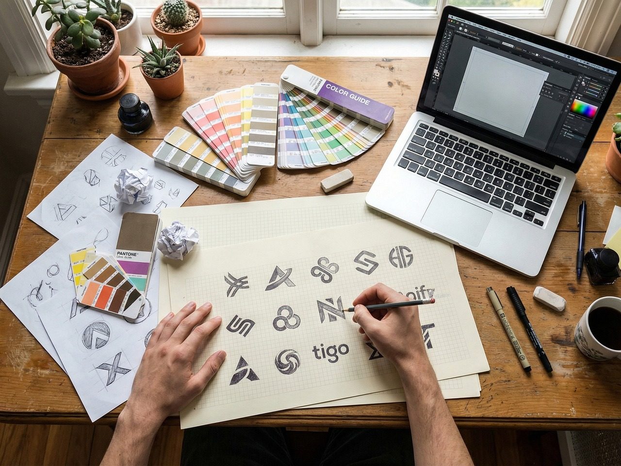
- A wordmark is the name set in designed type. An icon or symbol is the pictorial mark. A logo can be either or both, and most brands need versions of each.
- Lockup
- A fixed arrangement of logo elements, such as the icon beside the wordmark, that must not be rearranged.
- Clear space
- The protected area around the logo where nothing else may sit, defined in the brand book as a multiple of a logo element.
- Vector file
- Artwork made of mathematical shapes, so it scales to any size without blurring. Logos must be supplied as vector files: AI, EPS, SVG or PDF.
- Pantone, CMYK, RGB, hex
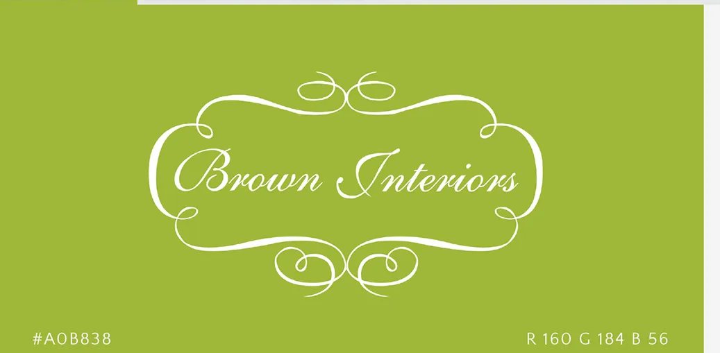
- Colour systems for spot printing, four-colour printing, screens and the web. A brand colour needs all four values so it matches everywhere.
- Brand book
- The document that explains the strategy, messaging and identity rules so anyone can produce work that looks and sounds like the brand.
- Tagline
- A short line that states the promise. It sits with the logo in some applications and is written during messaging, not design.
- Voice and tone
- Voice is the brand’s consistent personality in words. Tone is how it adjusts for the moment: a complaint, a launch, a condolence.
- Dieline
- The flat template of a package showing cuts and folds, supplied by the printer, on which packaging artwork is built.
- Refresh vs. rebrand
- A refresh modernizes an existing identity and keeps its recognition. A rebrand, the work of a rebranding agency, replaces it, usually because the business or its audience changed.